
BrewDog overhauls their branding and identity
BrewDog have today unveiled their new branding and label designs to the public, after teasing on social media that 'Change Is Brewing', as well as a tweet from company captain James Watt.
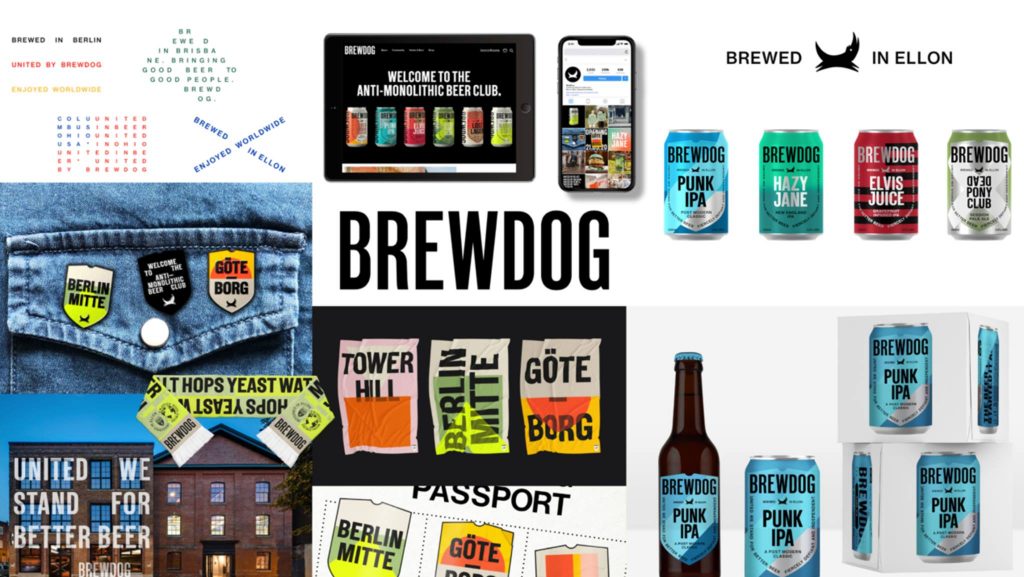
As well as a slight tweak on their well-loved dog logo, they also revealed what their new bottle and can designs will look like.
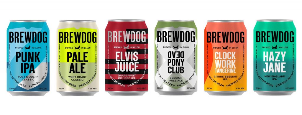
The rebrand has gained criticism however from EFPs and fans alike, claiming that they have toned down their 'punk' roots, and that the new labels will blend into supermarket shelves all too easily than their current distinctive packaging. Also, there have been comments that the designs look a bit familiar to another well-known brewery...
The new branding definitely does look a lot cleaner and more refined, and those 4-packs look more like something you'd find in an Apple Store than your local supermarket craft beer aisle.
All in all, the rebrand could have been a lot worse, and can be nowhere as bad as the website launch that was hampered with issues from the start. Let's hope the contents of the packaging don't start to lose their identity as well...
Love it or hate it, I'm sure we'll all have something new to talk about next month. Personally I much preferred their original can designs
Here's to another new chapter of BrewDog!